
From Tap to Track
Reimagining an intelligent Luas ticketing experience
Project for
Luas Tram System, Dublin
Industry
Automotive & Transportation
Duration
4 weeks
Scope of work
Research, Service Design, Product Design, Design System
Deliverables
Insights & pain-points, Archetypes, As-is journey maps, Service blueprint, Product design artefacts
From Tap to Track
Reimagining an intelligent Luas ticketing experience
Project for
Luas Tram System, Dublin
Industry
Automotive & Transportation
Duration
4 weeks
Scope of work
Research, Service Design, Product Design, Design System
Deliverables
Insights & pain-points, Archetypes, As-is journey maps, Service blueprint, Product design artefacts
From Tap to Track
Reimagining an intelligent Luas ticketing experience
Project for
Luas Tram System, Dublin
Industry
Automotive & Transportation
Duration
4 weeks
Scope of work
Research, Service Design, Product Design, Design System
Deliverables
Insights & pain-points, Archetypes, As-is journey maps, Service blueprint, Product design artefacts
challenge
Luas is the tram system in Dublin, Ireland and plays a vital role in the city’s daily commute and tourism. However, the current ticket-buying experience feels outdated and confusing, particularly for first-time users and visitors.
Poorly designed ticket machine interfaces and unclear signage often leave passengers unsure of what to do, leading them to seek help from others, which creates delays and crowding.
The challenge was to create a smarter, more intuitive ticketing system that makes travel seamless and stress-free for all kinds of commuters.
The aim was to identify the different pain points in the current experience and to understand how AI can address the gaps and enhance the future experience.
challenge
Luas is the tram system in Dublin, Ireland and plays a vital role in the city’s daily commute and tourism. However, the current ticket-buying experience feels outdated and confusing, particularly for first-time users and visitors.
Poorly designed ticket machine interfaces and unclear signage often leave passengers unsure of what to do, leading them to seek help from others, which creates delays and crowding.
The challenge was to create a smarter, more intuitive ticketing system that makes travel seamless and stress-free for all kinds of commuters.
The aim was to identify the different pain points in the current experience and to understand how AI can address the gaps and enhance the future experience.
challenge
Luas is the tram system in Dublin, Ireland and plays a vital role in the city’s daily commute and tourism. However, the current ticket-buying experience feels outdated and confusing, particularly for first-time users and visitors.
Poorly designed ticket machine interfaces and unclear signage often leave passengers unsure of what to do, leading them to seek help from others, which creates delays and crowding.
The challenge was to create a smarter, more intuitive ticketing system that makes travel seamless and stress-free for all kinds of commuters.
The aim was to identify the different pain points in the current experience and to understand how AI can address the gaps and enhance the future experience.
approach
Desk Research
Ethnographic Field Study
Persona/ Archetype Mapping
As-is Journey Blueprinting
Pain Point Analysis
Future-state Blueprinting
Feature Identification
Wireframes - Low/High Fidelity
Rapid Prototyping
High Fidelity Prototype
Design System
approach
Desk Research
Ethnographic Field Study
Persona/ Archetype Mapping
As-is Journey Blueprinting
Pain Point Analysis
Future-state Blueprinting
Feature Identification
Wireframes - Low/High Fidelity
Rapid Prototyping
High Fidelity Prototype
Design System
approach
Desk Research
Ethnographic Field Study
Persona/ Archetype Mapping
As-is Journey Blueprinting
Pain Point Analysis
Future-state Blueprinting
Feature Identification
Wireframes - Low/High Fidelity
Rapid Prototyping
High Fidelity Prototype
Design System
solution
A smarter, more intuitive ticketing experience powered by AI, designed to streamline purchasing, reduce queues, and personalise travel for Dublin’s commuters and visitors.
The new journey supports scalable growth, decreases reliance on in-person support, and significantly improves ticket purchase success rates — ultimately making public transport more accessible, efficient, and user-friendly.
End-to-End Service Design Approach
Intuitive, simple and clean user interface powered by AI
Personalisation in responses
solution
A smarter, more intuitive ticketing experience powered by AI, designed to streamline purchasing, reduce queues, and personalise travel for Dublin’s commuters and visitors.
The new journey supports scalable growth, decreases reliance on in-person support, and significantly improves ticket purchase success rates — ultimately making public transport more accessible, efficient, and user-friendly.
End-to-End Service Design Approach
Intuitive, simple and clean user interface powered by AI
Personalisation in responses
my role
Created a service design strategy, mapping end-to-end passenger and operational journeys to identify friction points and design opportunities across both physical and digital touchpoints.
Integrated AI features and data layers into the service blueprint, aligning passenger needs with operational insights to deliver a future-ready, adaptive solution.
Designed intuitive flows, wireframes, and high-fidelity prototypes focused on reducing confusion and improving accessibility.
Developed a scalable design system to ensure visual and functional consistency, with the flexibility to be extended across other Dublin transport services such as Dublin Bus and DART.
my role
Created a service design strategy, mapping end-to-end passenger and operational journeys to identify friction points and design opportunities across both physical and digital touchpoints.
Integrated AI features and data layers into the service blueprint, aligning passenger needs with operational insights to deliver a future-ready, adaptive solution.
Designed intuitive flows, wireframes, and high-fidelity prototypes focused on reducing confusion and improving accessibility.
Developed a scalable design system to ensure visual and functional consistency, with the flexibility to be extended across other Dublin transport services such as Dublin Bus and DART.
problem statement
How might we improve the experience of the using the ticketing machine at Luas stops in Dublin so that the users find it easier and faster to purchase tickets for the tram, reducing pressure on support teams and ultimately making Dublin’s public transport smarter, seamless, and scalable?
28
days
24
insights
2
journey maps
2
blueprints
1
interactive prototype
1
design system
1 week
research, field study
2 days
as-is journey
4 days
future blueprint
2 days
low-fi wireframes
4 days
hi-fi wireframes
1 week
hi-fi prototype
user research
I take the Luas regularly and kept noticing the same thing - tourists and non-locals standing at the ticket machine, confused, looking for help. Some approached me for help directly, other times I just jumped in. A few gave up entirely and called a cab instead, which honestly said a lot.
That got me curious, so I tried the machine myself a few times to see what the experience was like with a fresh pair of eyes. I also spent some off-peak hours chatting with commuters and observing how they interacted with it. With those insights, I set out to redesign the ticketing experience into something more modern and intuitive.
stakeholders
Passengers/Commuters
Luas Operations Team
Customer Support
Backend Development Team
Ticket/Leap Card Validation Team
pain points
Outdated & complicated process to buy paper tickets - creates confusion in users
Machines or validators sometimes fail, leaving users unsure how to proceed.
Users face confusion about when/where they have to board the tram, where to get off and where to change trams.
Machines reject large notes, run out of change, or can’t process certain cards.
behaviour archetypes
First time users
They are either tourists or occasional riders unfamiliar with Dublin’s tram system.
pain points
Outdated tedious machines
Unclear signage, and fear of making mistakes while buying tickets.

Daily commuters
They take the tram regularly and mostly use the Leap Card instead of buying tickets everytime.
pain points
Frustrated by delays
Redundant steps while topping up.
Rush-hour users
They are mostly use leap cards & travel during peak hours where speed and efficiency are critical.
pain points
Queues, overcrowding
Out-of-order leap card machines to tag on/off.

Connected customers
They are tech-forward passengers preferring clean, minimalistic digital experiences.
pain points
Frustration when forced to rely on outdated hardware like ticket machines
Manual inputs for every query
Accessibility advocates
They require simple, accessible and reliable digital experiences to easily purchase tickets.
pain points
Complex ticket machines
Lack of assistance
Lack of clear signage
as-is journeys
Using Figjam, I mapped out the as-is user experience of the commuters while purchasing tickets, both digital & physical tickets, to identify their pain points and frustrations.
<- Scroll both ways to see the full journeys ->
Ticket purchase via machine - Physical ticket


Ticket purchase via machine - Leap card method


to-be user journey / blueprint
I developed a to-be journey map/service design blueprint, redesigning each touchpoint, and transforming a confusing ticket-buying process into a smooth, guided experience for every commuter.

to-be user journey / blueprint
I developed a to-be journey map/service design blueprint, redesigning each touchpoint, and transforming a confusing ticket-buying process into a smooth, guided experience for every commuter.

designing the experience
Following the research, I sketched out some schematics and wireframes to work through the app's information architecture. From there, I moved to paper wireframes, then digital wireframes and a low-fidelity prototype, which I used to run usability studies with stakeholders.
When I started redesigning the purchasing experience for Luas ticketing machine, my goal was to design something that truly understands its users, an experience that feels empathetic, intuitive and encouraging. It should be able to sense what a person needs quickly and respond efficiently, without making them feel rushed or confused.
I also drew from my experiences growing up in India, where technology use varies so widely. There, I’ve seen folks preferring to interact with highly digital services and others more comfortable using analogue systems. I remember buying train tickets at the counter - the conversations with the staff behind the counter being warm, helpful and confident. They’d suggest better trains or seats, make sure you got good value for your money, and even ask clarifying questions if something didn’t add up. They could tell instantly whether someone was a first-time traveller or a regular and would adapt their approach accordingly. That kind of human sensitivity is what I’ve tried to capture in this design — the ability for an interface to feel just as thoughtful, observant, and reassuring as the person behind the counter once did.
Following the research, I sketched out some schematics and wireframes to work through the app's information architecture. From there, I moved to paper wireframes, then digital wireframes and a low-fidelity prototype, which I used to run usability studies with stakeholders.
When I started redesigning the purchasing experience for Luas ticketing machine, my goal was to design something that truly understands its users, an experience that feels empathetic, intuitive and encouraging. It should be able to sense what a person needs quickly and respond efficiently, without making them feel rushed or confused.
I also drew from my experiences growing up in India, where technology use varies so widely. There, I’ve seen folks preferring to interact with highly digital services and others more comfortable using analogue systems. I remember buying train tickets at the counter - the conversations with the staff behind the counter being warm, helpful and confident. They’d suggest better trains or seats, make sure you got good value for your money, and even ask clarifying questions if something didn’t add up.
They could tell instantly whether someone was a first-time traveller or a regular and would adapt their approach accordingly. That kind of human sensitivity is what I’ve tried to capture in this design — the ability for an interface to feel just as thoughtful, observant, and reassuring as the person behind the counter once did.
28
days
349
variables
690
components
18
text styles
2
brand themes
1
design system
sitemap
I created a structured schematic to outline the pages, flow and content hierarchy of the kiosk experience. Initially, the flow was complicated and convoluted with unnecessary clicks or pages but the goal was to simplify the structure and help the user get to their destination as quickly as possible in as few decisions as possible.
The map below follows the four numbered steps shown in the kiosk's own breadcrumb - Select stop, Select ticket, Pay for ticket, Collect card & ticket - with cash and card treated as one step that branches and rejoins, rather than two separate flows.
I created a structured schematic to outline the pages, flow and content hierarchy of the kiosk experience. Initially, the flow was complicated and convoluted with unnecessary clicks or pages but the goal was to simplify the structure and help the user get to their destination as quickly as possible in as few decisions as possible.
The map below follows the four numbered steps shown in the kiosk's own breadcrumb - Select stop, Select ticket, Pay for ticket, Collect card & ticket - with cash and card treated as one step that branches and rejoins, rather than two separate flows.

paper wireframes
I sketched out a bunch of layouts to figure out how the ticketing screen's information should be structured, then combined the best parts into one refined design. I also kept in mind that commuters aren't all in the same headspace - rushed, unfamiliar with the machine, juggling bags - so I focused on simplifying the flow for everyone.
The goal was to explore ideas quickly through wireframes before committing to anything.


digital wireframes
For this step, I used Figma tool to convert the sketches into low-fidelity digital wireframes to understand the high-level interaction between the screens, and gaps in the workflow. I also used these wireframes to perform usability studies with a few users.

usability studies
I ran unmoderated usability tests with a few participants, who answered questions about the flow and shared their thoughts while interacting with the low-fidelity prototype created through wireframes. Once I had the data, I analysed and synthesised the information, and pulled out key themes and insights.
The goal was to catch pain points early, so they could be fixed before the final designs were locked in."
A more intuitive search experience — match on intent (landmark names resolve toward the nearest real stop from the first keystrokes) rather than plain substring matching, and show why a result is suggested.
Language change on the Home screen — make the invitation itself language-agnostic (icons/flags, not an English sentence), give it equal visual weight to the greeting, and keep a persistent switcher on later screens.
Intent-based error messages - The error messages must not only clearly explain the error but also show the next steps required to rectify it.
refining the experience
Following the wireframes phase and keeping in mind the insights and conclusions from usability studies, I created static high-fidelity screens, mockups, and an interactive prototype as tangible outputs envisioning the ticket purchasing user experience for Luas commuters.
solution
1.
Designed an intuitive, AI-powered ticketing experience that adapts to different commuter archetypes, offering personalised recommendations based on user needs.
2.
Enhanced search functionality to make stop selection effortless — for example, if a user types in a general area, the system suggests nearby Luas stops automatically.
3.
Added context-aware suggestions for nearby activities and points of interest, enhancing the travel experience for tourists and leisure travellers.
4.
Built AI-driven fare optimisation, analysing selected ticket types to offer better-value alternatives where savings are available.
5.
Implemented step-by-step payment guidance with visual cues — including LED indicators and on-screen prompts — to direct users through each stage, reducing confusion and delays.
6.
Integrated QR codes on both digital and printed tickets, allowing passengers to track their journey live and receive timely alerts for when to disembark.
7.
Added a Day Pass option, simplifying travel for tourists by eliminating the need to purchase separate tickets throughout the day.
8.
Created a future-proof service blueprint with 2 additional layers to visualise AI interactions on the frontend and data collection/analysis on the backend.
9.
Introduced a clean, interactive route and zone map to provide a simple, visual guide for stop selection and journey planning.
10.
Enabled data-driven insights to forecast demand, analyse passenger behaviour by time of day, and continuously refine the ticketing experience.
mockups


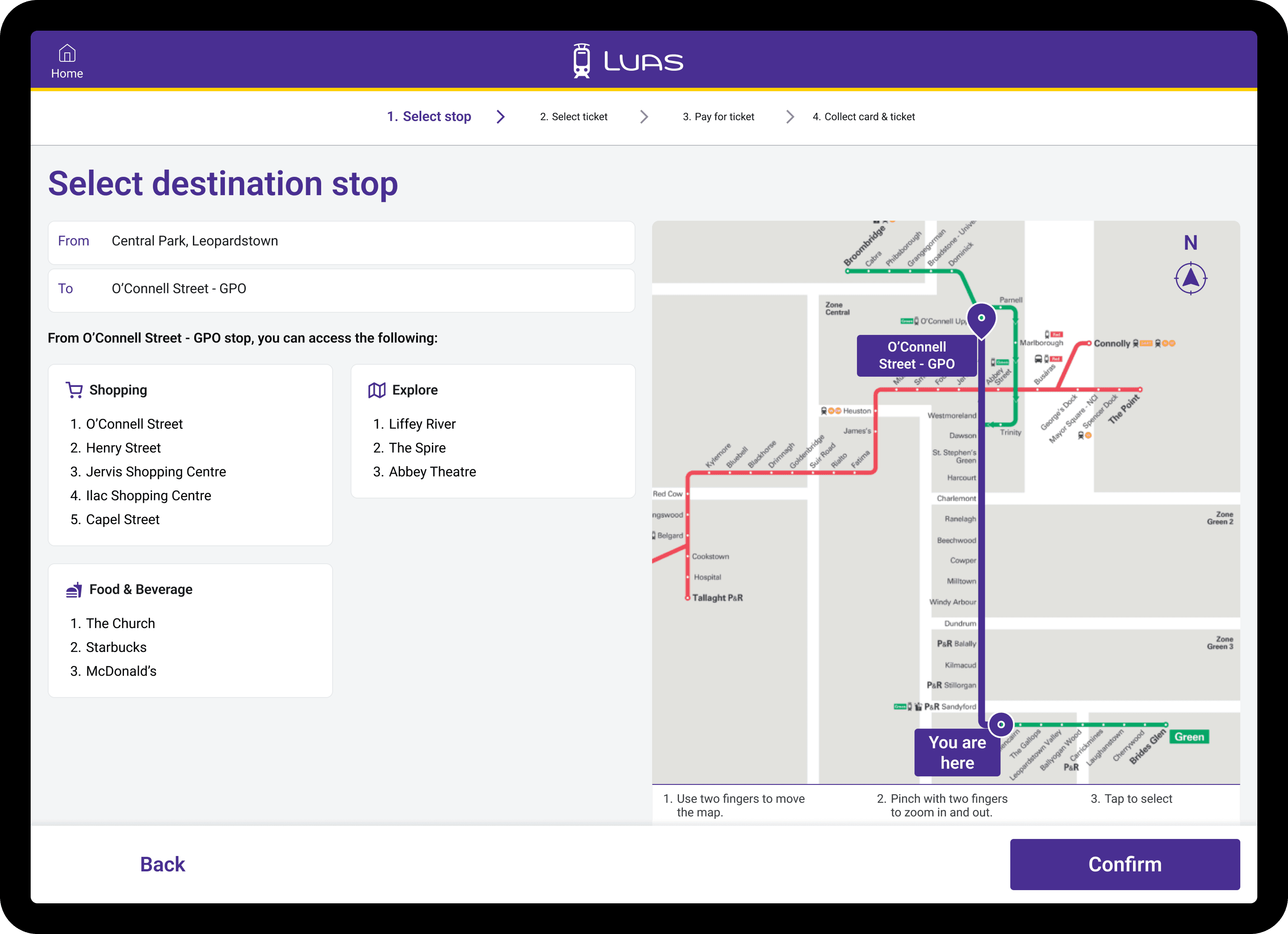


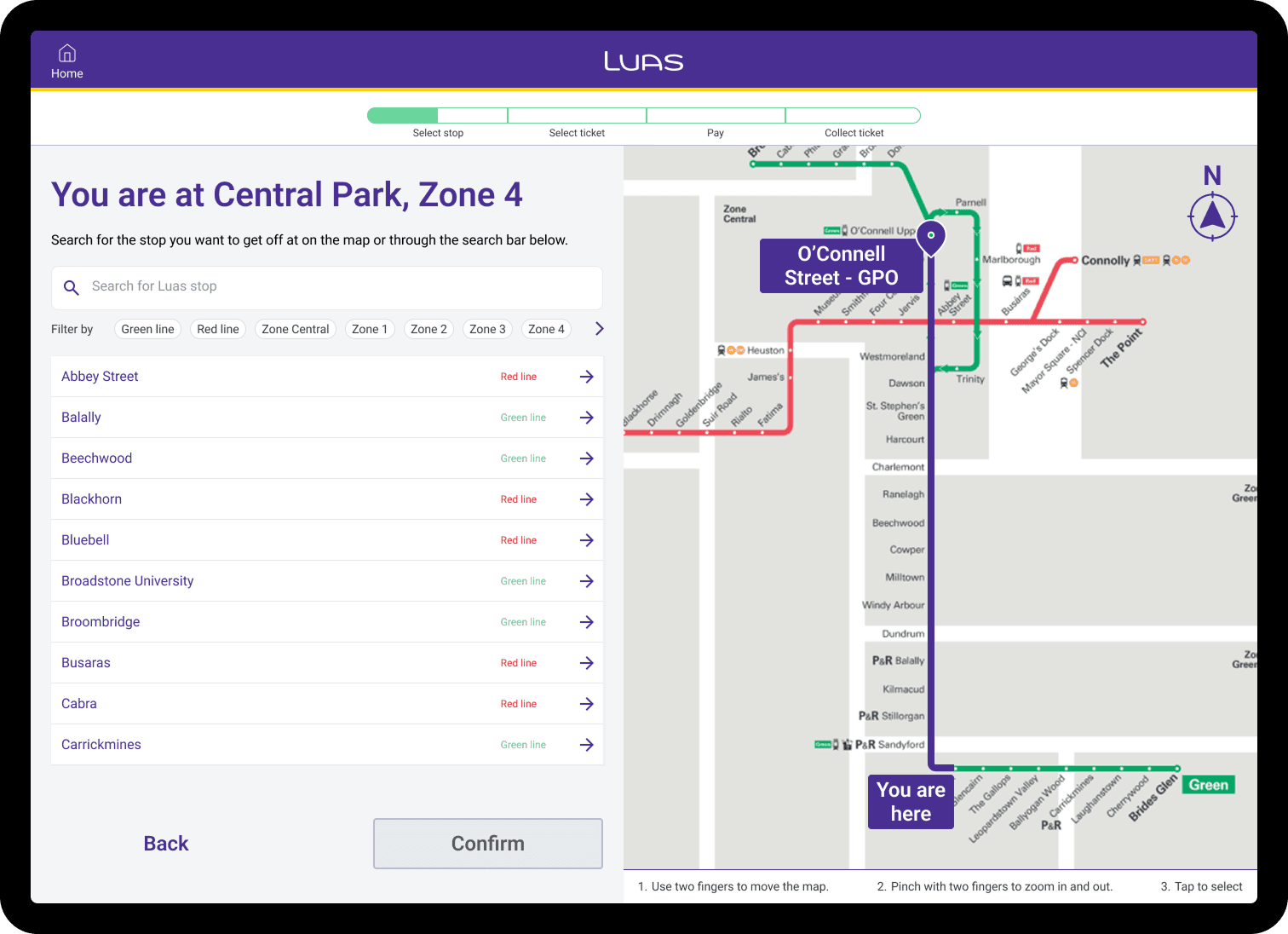
Stepper component added to guide the users through the process, improving clarity, reducing cognitive load, and boosting confidence by showing progress and what’s next.
AI-powered suggestions about places to explore around the selected destination.
Simple, clear map for users to interact with, visually locate stops, and know the distance to destination.
Option for users to choose audio guidance with icon offers users a non-visual way into the flow.
Option to switch language surfaces immediately making the experience language-agnostic, without having to navigate much.
Clearly weighted, simple primary buttons to make choices instantly clear to the users.
A single fare table covering six ticket types with quantity control and plus/minus buttons clearly indicated.
The user can always see the ticket quantity selected with the amount to be paid.
A quick option to directly opt for group ticket.
Three fare options laid put side-by-side with unique attributes listed for easy comparison.
A dismissible overlay, not a forced choice so that declining the upsell is just as available as accepting it.
Savings shown explicitly on the alternatives making the best option easy to spot for the user.
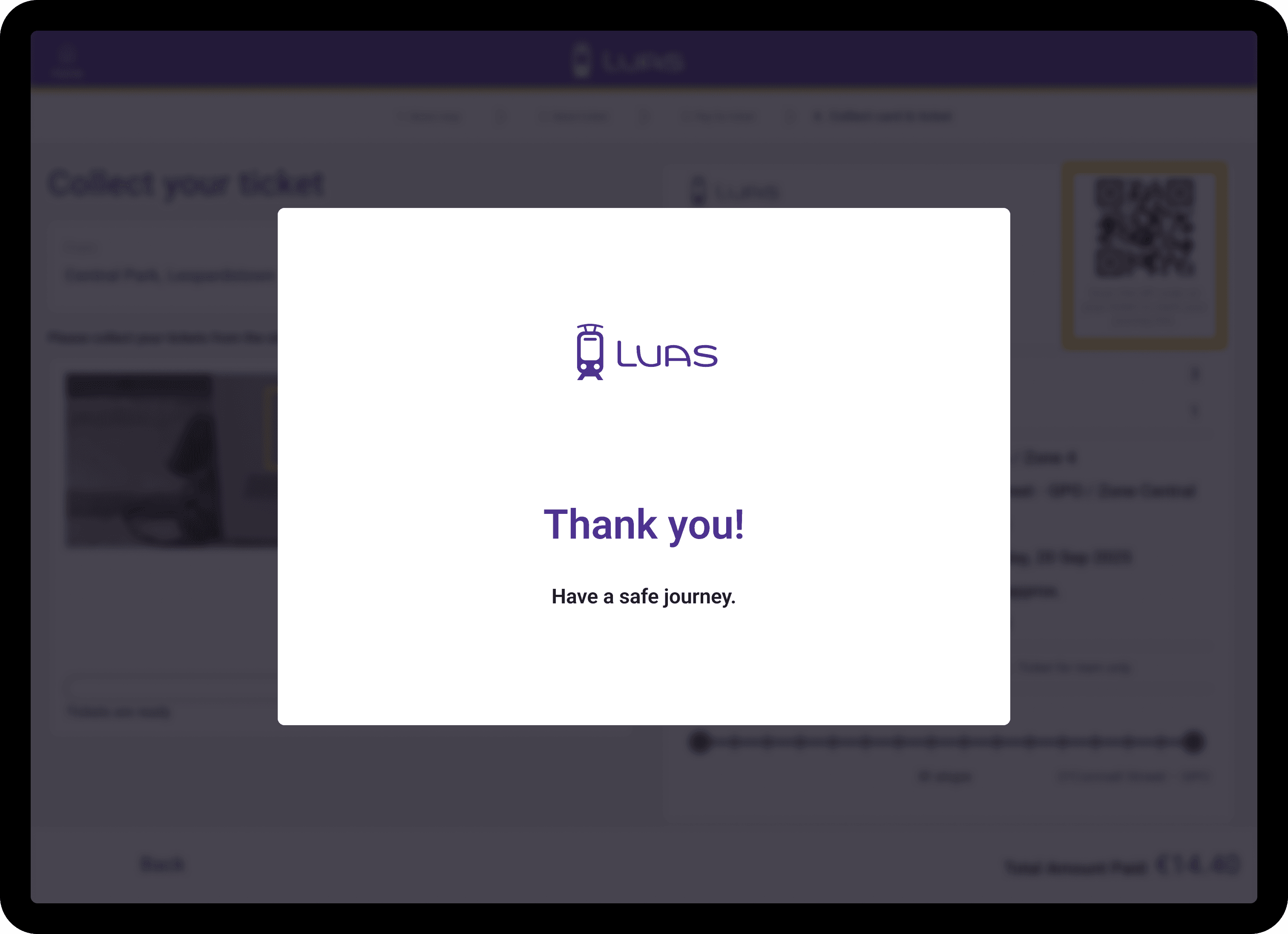
A QR code with an explicit purpose stated next to it, highlighted in yellow, so that the users are not left scanning it blind later.
The digital ticket displays detailed guidance on their journey including visuals representation to the users, reducing confusion.
The photo of the actual physical slot, with the exact spot highlighted. Rather than just text instructions removing any ambiguity.
sitemap
I created a structured schematic to outline the pages, flow and content hierarchy of the kiosk experience. Initially, the flow was complicated and convoluted with unnecessary clicks or pages but the goal was to simplify the structure and help the user get to their destination as quickly as possible in as few decisions as possible.
The map below follows the four numbered steps shown in the kiosk's own breadcrumb - Select stop, Select ticket, Pay for ticket, Collect card & ticket - with cash and card treated as one step that branches and rejoins, rather than two separate flows.

paper wireframes
I sketched out a bunch of layouts to figure out how the ticketing screen's information should be structured, then combined the best parts into one refined design. I also kept in mind that commuters aren't all in the same headspace - rushed, unfamiliar with the machine, juggling bags - so I focused on simplifying the flow for everyone.
The goal was to explore ideas quickly through wireframes before committing to anything.

digital wireframes
For this step, I used Figma tool to convert the sketches into low-fidelity digital wireframes to understand the high-level interaction between the screens, and gaps in the workflow. I also used these wireframes to perform usability studies with a few users.

usability studies
I ran unmoderated usability tests with a few participants, who answered questions about the flow and shared their thoughts while interacting with the low-fidelity prototype created through wireframes. Once I had the data, I analysed and synthesised the information, and pulled out key themes and insights.
The goal was to catch pain points early, so they could be fixed before the final designs were locked in."
A more intuitive search experience — match on intent (landmark names resolve toward the nearest real stop from the first keystrokes) rather than plain substring matching, and show why a result is suggested.
Language change on the Home screen — make the invitation itself language-agnostic (icons/flags, not an English sentence), give it equal visual weight to the greeting, and keep a persistent switcher on later screens.
Intent-based error messages - The error messages must not only clearly explain the error but also show the next steps required to rectify it.
refining the experience
Following the wireframes phase and keeping in mind the insights and conclusions from usability studies, I created static high-fidelity screens, mockups, and an interactive prototype as tangible outputs envisioning the ticket purchasing user experience for Luas commuters.
solution
1.
Designed an intuitive, AI-powered ticketing experience that adapts to different commuter archetypes, offering personalised recommendations based on user needs.
2.
Enhanced search functionality to make stop selection effortless — for example, if a user types in a general area, the system suggests nearby Luas stops automatically.
3.
Added context-aware suggestions for nearby activities and points of interest, enhancing the travel experience for tourists and leisure travellers.
4.
Built AI-driven fare optimisation, analysing selected ticket types to offer better-value alternatives where savings are available.
5.
Implemented step-by-step payment guidance with visual cues — including LED indicators and on-screen prompts — to direct users through each stage, reducing confusion and delays.
6.
Integrated QR codes on both digital and printed tickets, allowing passengers to track their journey live and receive timely alerts for when to disembark.
7.
Added a Day Pass option, simplifying travel for tourists by eliminating the need to purchase separate tickets throughout the day.
8.
Created a future-proof service blueprint with 2 additional layers to visualise AI interactions on the frontend and data collection/analysis on the backend.
9.
Introduced a clean, interactive route and zone map to provide a simple, visual guide for stop selection and journey planning.
10.
Enabled data-driven insights to forecast demand, analyse passenger behaviour by time of day, and continuously refine the ticketing experience.
mockups
Stepper component added to guide the users through the process, improving clarity, reducing cognitive load, and boosting confidence by showing progress and what’s next.
AI-powered suggestions about places to explore around the selected destination.
Simple, clear map for users to interact with, visually locate stops, and know the distance to destination.
Option for users to choose audio guidance with icon offers users a non-visual way into the flow.
Option to switch language surfaces immediately making the experience language-agnostic, without having to navigate much.
Clearly weighted, simple primary buttons to make choices instantly clear to the users.
A single fare table covering six ticket types with quantity control and plus/minus buttons clearly indicated.
The user can always see the ticket quantity selected with the amount to be paid.
A quick option to directly opt for group ticket.
Three fare options laid put side-by-side with unique attributes listed for easy comparison.
A dismissible overlay, not a forced choice so that declining the upsell is just as available as accepting it.
Savings shown explicitly on the alternatives making the best option easy to spot for the user.
A QR code with an explicit purpose stated next to it, highlighted in yellow, so that the users are not left scanning it blind later.
The digital ticket displays detailed guidance on their journey including visuals representation to the users, reducing confusion.
The photo of the actual physical slot, with the exact spot highlighted. Rather than just text instructions removing any ambiguity.
impact
1.
Simplifies travel for both daily commuters and first-time users, especially tourists.
2.
Reduces confusion and delays at ticket machines through clear, guided interactions.
3.
Provides real-time, personalised support while also giving operators actionable insights through data analytics.
4.
Future-proofs Dublin’s transport ecosystem with a scalable, AI-driven framework.
key takeaways
1.
Overcoming research barriers:
1.
Some users were hesitant to participate in interviews, which limited direct feedback. To work around this, I observed passenger behaviour at stops, gathering valuable insights without disrupting their journey.
2.
AI as an enabler:
2.
Leveraging AI made the overall experience more intuitive and engaging, demonstrating how emerging technologies can humanise complex systems.
3.
Scalability mindset:
3.
While focused on Luas, the system was designed to be future-ready, scalable across other Dublin public transport systems.
4.
Interactive map:
3.
Develop a more interactive and accessible Luas map so that the users can zoom in/out, tap stops to select, with highlighted routes, larger touch targets, and high-contrast labels for better visibility.
5.
Improving language and search:
3.
Test the language accessibility and search experience for non-English speakers for a focused round of testing before implementing further changes.
impact
1.
Simplifies travel for both daily commuters and first-time users, especially tourists.
2.
Reduces confusion and delays at ticket machines through clear, guided interactions.
3.
Provides real-time, personalised support while also giving operators actionable insights through data analytics.
4.
Future-proofs Dublin’s transport ecosystem with a scalable, AI-driven framework.
key takeaways
1.
Overcoming research barriers:
1.
Some users were hesitant to participate in interviews, which limited direct feedback. To work around this, I observed passenger behaviour at stops, gathering valuable insights without disrupting their journey.
2.
AI as an enabler:
2.
Leveraging AI made the overall experience more intuitive and engaging, demonstrating how emerging technologies can humanise complex systems.
3.
Scalability mindset:
3.
While focused on Luas, the system was designed to be future-ready, scalable across other Dublin public transport systems.
4.
Interactive map:
3.
Develop a more interactive and accessible Luas map so that the users can zoom in/out, tap stops to select, with highlighted routes, larger touch targets, and high-contrast labels for better visibility.
5.
Improving language and search:
3.
Test the language accessibility and search experience for non-English speakers for a focused round of testing before implementing further changes.
personal note:
personal note:
This project is still very much a work in progress for me. Every day, I wake up with new ideas — small or big — that could make the service better, more thoughtful, and more impactful. I don’t see it as something that’s “done,” but as something that keeps evolving as I learn and observe more. My goal is to continue refining it, making it stronger and more scalable over time.
Thank you for taking the time to explore it with me.
This project is still very much a work in progress for me. Every day, I wake up with new ideas — small or big — that could make the service better, more thoughtful, and more impactful. I don’t see it as something that’s “done,” but as something that keeps evolving as I learn and observe more. My goal is to continue refining it, making it stronger and more scalable over time.
Thank you for taking the time to explore it with me.
personal note:
This project is still very much a work in progress for me. Every day, I wake up with new ideas — small or big — that could make the service better, more thoughtful, and more impactful. I don’t see it as something that’s “done,” but as something that keeps evolving as I learn and observe more. My goal is to continue refining it, making it stronger and more scalable over time.
Thank you for taking the time to explore it with me.
other projects
other projects